The website world has shifted because of large companies like Amazon and Google who are constantly pushing the envelope of website capabilities. The bar has been set very high and all other businesses are forced to shift their mentality or get left in the dust by more savvy competitors. Especially if you’re a product company, you know that your e-commerce site is either excellent or antiquated. You must provide a typical user experience along with a familiar look and feel or customers will find somebody else that supplies the experience they’re accustomed to. If you do much shopping online, you’ve already made the shift. You stay away from sellers that haven’t adapted.
The following article is exhaustive while remaining not too technical. In fact, many SEOs (search engine optimization experts) will criticize how much of the technical we’ve avoided.
HEY SEOs! This article isn’t for you.
This article is for the average business owner or marketer who doesn’t spend all their time steeped in code. As a result, you won’t find this article riddled with technical jargon. Instead, we focus on two primary areas: structural and visual components. It’s all blended together in a cohesive approach that makes sense to the great majority of readers.
1. Establish Website Goals
What do you want your website to accomplish? We break up websites into three primary categories:
- Informational: A simple approach to web design. Something basic that communicates the most high-level ideas about products or services.
- E-commerce: For selling products or services through a website.
- Conversion: An emphasis on turning visitors into buyers. Whether a multi-step process that integrates a website with other sophisticated tools, or a website that sells directly through the site as fast as possible, there are ways to shorten the buying process with a website that handles the flow of clicking.
What types of visitors do you want to attract ?
What kind of impression do you want to make?
What kind of revenue needs to be generated?
It’s important you understand that to reach your goals, you need to support your website with a marketing budget to drive traffic to it. You can’t just “build it and they will come.”
2. Improve Your Website Photos
Your Photos Suck:
Yes, that was an emphatic statement. Based on the thousands of websites we’ve evaluated over the years, the vast majority include terrible images, which is a shame. Anyone with a credit card has access to millions of professional images from sites like:
BIGSTOCK We prefer BIGSTOCK for pricing
Use these! Stop skimping and trying to get by with photos from a five-megapixel camera. If your site looks cheap, your potential customers will know you’re cheap too. If you invest just $79.99 with BIGSTOCK, you get 50 professional grade images. It’s a no brainer.
Use A Real Camera:
I’m not suggesting you need to go out and purchase the latest Canon or Nikon for several thousand dollars, but some of our clients like to send us pictures they’ve taken using a smartphone with a cracked screen and a scratched lens. Just don’t. Really, it’s lame. Some of the high-end smartphones or even a $100 camera can take great pictures.
You’ll know if your photos were taken using a bad camera (or bad camera settings) when you blow up the picture on a computer screen and see that everything is pixelated. Pixelation makes photos look like the old 8-bit video games that were blocky around the edges. Always take the extra step to look at photos closely before trying to use them in a website.
Improve Your Photo Lighting:
The largest difference between someone with an expensive camera and a professional commercial photographer is lighting. Without the funky umbrellas, reflectors, and light boxes, your images will be devoid of the kind of details required for a flagship image. If stock images do not suffice, hire a photographer that will capture unique images of your products, location, people and anything that matters.
If you insist on taking the pictures yourself, here are a few pointers:
- I can’t believe I need to say this, but don’t point your camera at the light source
- Don’t take photos with a light behind the object so it creates a hard shadow directly in front of what you’re shooting
- In fact, don’t use a super bright light that creates any hard shadows
- The color of your bulbs and walls will determine the color of your shot
- Use multiple lights pointing from different angles to eliminate shadows and evenly light the object
- If you’re serious, visit your local photography shop for pointers about lighting and how to properly diffuse light
Make Sure Your Photos Are In Focus:
People are way too excited about the photos they think are interesting and “artistic.” Any time I go to an art show, I’m shocked to see how many photographers are selling out-of-focus photos. They either took the photo from too far away using the wrong lens, or they just didn’t make the proper lens adjustments.
Some of the software in smartphones can help you cheat. If you’re using a high-end smartphone with a great camera, you can usually tap on the area of the screen you’d like to keep in focus and capture something decent. Again, double check the fine details by zooming in on the photo that was taken. Until you know things aren’t fuzzy, your work is not complete.
There’s no better example of the importance of focus than food shots. The details of the image below should make your mouth water.
Your Photo Composition Is Terrible:
What, in your opinion, makes a photo great? That’s obviously a subjective question, but there are some basic rules:
- Clinical is old. Warm up and try to look human or people will find a competitor who already does.
- Make sure people aren’t wearing a bunch of crazy patterns.
- Don’t take pictures from far away. It increases the fuzz factor because you’re relying on zoom which can quickly degrade the photo. Accidental movement from far away makes photos ultra-fuzzy.
- Keep the photo simple. Jamming as much as you can into a shot usually means you dilute the value of the most important part of the photo. If you do any research at all, you’ll find that the best ads, best photos, even the best graphic designs are super simple.
- Some foods, like refried beans, look like crap. Seriously. Shit on a plate. They might be served at a restaurant, but take photos of whole beans as an alternative.
- Consider your audience and what they want to feel when they look at your photos. If you have an amazing spa and want people to feel warm, comfortable, and cozy, don’t feature a picture of a giant lotion bottle on your homepage.
Legal Concerns With Photos:
Don’t ever use Google to find your images and assume you have a legal right to them. If you’re using photos without the right to do so, you’re placing yourself at significant legal risk. Copyright infringement for photos can be pretty serious and cost hundreds of millions of dollars in the most egregious instances.
There are ways to get around paying for images online, but the pickings are slim. Make sure the photos are available under a Creative Commons License. This isn’t full proof because someone can steal the photo, then post it online claiming creative commons licensing. That’s the risk you run for “free.”
Using photos of people that haven’t signed a photo release document is also a very bad idea. It may be a previous business partner, disgruntled employee, or even an estranged friend that decides to stick it to you with a lawsuit after a bitter breakup. Don’t ever use photos of people without written consent.
The Case For A Professional:
Taking a timeless picture that can be leveraged for years to come requires know how, practice, and tons of shots at different angles with different lighting combinations. A commercial photographer has already done this many times over. They’ve been in the trenches taking photos of weird stuff like floors, medical equipment, uncooperative children and moving cars.
A true commercial photographer has studied and practices the science behind shutter speed, aperture, proper settings for various lenses, color temperature, light diffusion and myriad more technical factors that make a photo a photo. They also understand the convergence of digital and analog technologies and how they work in conjunction to capture something truly amazing.
If you’re on the fence about hiring a real photographer, consider what one of your photos would look like on a billboard. Would you spend thousands of dollars every month on a billboard using the image in mind? If not, don’t put it on your website. Pay an expert to get it right.
If you have some suggestions about helping people improve their photos, please share in the comments below. We appreciate your input.
3. Improve Your Website Structure
There’s a whole world of specialists dedicated to making websites better who unfortunately do not understand how to communicate complex ideas to those who don’t already live in their world. At Modernize My Site, we want to be different. We respect those that have been successful without learning geek speak or even becoming technologically savvy. In fact, we admire those who can do so much without ever relying on computing power to make it happen.
The following is a description of website structure that will make sense to even the most technologically challenged:
You Need Multiple Website Pages:

What people search for to find a company like yours should always inform your website’s structure.
People often approach a website from a most basic cost savings perspective. They preface a quote for a website with, “I want something as simple as possible. I don’t need the extra frills and stuff that makes it interesting. I just want basic information on one page and I want to spend about three to five hundred dollars.”
I hope this isn’t your perspective. If it is, please keep reading. I promise you will appreciate what I have to teach you.
Someone that immediately agrees to building a “simple one-page website” without warning a buyer of potential pitfalls is a hack. They likely crank out websites as fast as possible and don’t care about what happens after the fact. And that’s the rub- what happens to a one-page website after it’s been built.
Search engines like Google, Bing and Yahoo! are looking for specific website structure. As soon as I mention this in conversations, people automatically jump to, “You mean like keywords and stuff, right?”
Yes, but not really.
Keywords are a tiny sliver of the overall pie that makes a website a website. A much larger piece of the pie is page structure. Without copy and images separated into different pages and sections throughout your site, search engines get confused. Search engines are looking for special code that tells them what is most important in a page like specially coded titles and brief descriptions. The major problem with a one-page site is that you can only code each page with one special title, one special description, and a myriad of other specially coded things that make a page unique.
If you want to get found online for the products or services you sell, a single page site isn’t going to cut it.
If you want to be considered a subject matter expert, other experts will wipe the floor with you because search engines can only pick up a few critical things in a single page site.
Finally, if you’d like to be competitive at all, a one-page site will leave you dead in the water. It is appalling how many companies’ websites cannot be found in the top ten of search results even when searching for them by name.
To get your hands dirty and learn more about proper page structure, there are some experts you should follow.
*** WARNING ***
You enter this world at your own risk. These people speak a completely different language with more acronyms than you’ll ever understand. It takes years of practice and delving deep into different tools before anyone can fully understand search engine optimization (SEO). If you take your time and treat this as a learning opportunity, you’ll be better for it. Don’t be surprised if you have to open your digital dictionary to define all the new terms.
Rand Fishkin- He’s got style and a trainer’s heart that’s warm and fuzzy
Neil Patel- One of the most influential online marketers in the world
Use The Right Page Names:
Creative types like to use quirky naming conventions for pages. Instead of something intuitive and familiar like “Products,” they might decide on “Our Stuff” instead. Yes, the creative mind works in mysterious ways.
Users can’t stand this. When they’re searching for products, they need a page name that’s familiar. If they have to click all over to decipher what is where, they will quickly abandon the site and find someone who isn’t trying to be different.
More importantly, search engines don’t know what to display if your page names don’t make sense. They will avoid sharing the “Our Stuff” page results because people aren’t searching for “Our Stuff” online. Bottom line- don’t try naming pages until you’ve done keyword research. Replace the “Our Stuff” with a key term that gets tens or hundreds of thousands of searches if possible. This is where keyword research comes in to play.
A good example is a client’s website we’re currently in the process of building. They specialize in winemaking, and a small percentage of their business is in homebrew. They sell homebrew supplies and teach people how to make their own beer. For years, this company has not had a page of their website dedicated to homebrew, but Google suggests this is where their greatest potential lies. Check out what some quick research below revealed about how to properly structure their website.

Google suggests that nationally there are between 100,000 and 1,000,000 searches per month for the term “homebrew” using their search engine. There are more searches for “homebrew” than an other term they need to rank for. They absolutely need a page dedicated to homebrew with all the right structure.
Another interesting thing is that almost nobody searches for “winemaking.” “Winemaking” is the proper spelling, but everyone searches for it using two words, “wine making.” Our strong recommendation is that the client misspell the page title and any occurrence of the term throughout the page to get the traffic for it.
Include Enough Content Per Page:
Copy
If you are not a writer, HIRE A COPYWRITER. I cannot stress this enough. This is the largest pain point of our business.
Some of our clients will try to provide as little copy as possible. In some cases, one sentence per page. This is not acceptable. If you want to get found, write at least a few paragraphs per page. The best practice is 500 to 1,000 words for the homepage and a minimum of 300 words for each subsequent page.
Also, bulleted lists are lame. If every one of your pages is a bulleted list, you’re killing your ability to get found online. Just to clarify, it’s not a bad idea to include a bulleted list in a page, but relying on them as the only way to explain what you do is weak.
When search engines display search results, it’s because they’ve found what they deem most relevant and valuable to a searcher. Make sure each of your pages is chalk full of descriptors, details and important information that make it more likely for your page to appear first in search results. This takes quite a bit of time to get right. Unless you write on a consistent basis, HIRE A COPYWRITER.

Media
Mixing copy with professional photos, personal photos, videos, animated videos, or something like the nifty GIF above are all great ideas. Including at least one of these per page helps you rank better and keeps readers more engaged, but make sure you’re not junking up your site with terrible photos.
Special Touches After the Fact
It’s worth mentioning there’s a laundry list of tasks to complete after a well written website is created. Feel free to learn about metadata, snippets, alt text, etc. Explaining these things beyond a simple mention would take us down the other worldly SEO path too technical for the average website owner.
4. Improve Your Website Security
Add An SSL Certificate:
It may seem like a bit of an outlier, but security is now required as part of your website’s structure. Google forced security measures in the way of what’s called a Secure Sockets Layer Certificate (SSL). Without it, users might reach an all red screen with a warning “This site may harm your computer.” Needless to say, this is a scary proposition.
The “This site may harm your computer” warning has been reserved traditionally for sites asking for sensitive information. Like sites requesting login credentials, social security numbers or credit card information that do not already include an SSL certificate. The SSL certificate secures the connection between web servers and browsers so sneaky hackers can’t steal information being transferred between them.
You may not absolutely have to have an SSL certificate for now, but we highly recommend one (practically force every client to have one) regardless of what kind of information is exchanged through your site. It will help protect users’ data and put you at ease knowing there’s at least something in place. Besides, Google is officially penalizing websites for not having an SSL installed, so it’s kinda dumb not to have one.
Add Captcha to Your Forms:
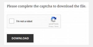
The Completely Automated Public Turing test to tell Computers and Humans Apart (CAPTCHA) helps to mitigate incessant SPAM to forms on your website. One version of CAPTCHA is that funny little box that has to be clicked when you fill out a form online. This helps to prevent bots (special tools used by hackers), from completing form after form after form on your website. When this happens abnormally fast in high volume, it can considerably slow down a server, and as a result, your website.
5. Make Sure the Website is Mobile Friendly
Mobile phone usage is reshaping the way we consume information. Smartphones today are to computers what computers were to books in the mid 90s. There are currently about 3 billion internet users worldwide, and in some countries, a smartphone is the only affordable way to access it. If your website is not mobile friendly, you’re already antiquated and should either give up, or make the shift immediately. Your competition has likely already made the shift to proper mobile website design, and visitors to your site using mobile devices are leaving it in droves.
84.3% of B2B buyers research a website before purchasing
We hear a lot of business owners say, “We sell only to other companies. We don’t need a better website because people aren’t buying from us based on our website.” That logic is self-defeating, and quite frankly, these business owners must live in a dark cave. A great article written by Lauren Kaye at Brafton Inc. more than three years ago suggests that 84.3% of B2B companies (businesses selling primarily to other businesses) were researching company websites before making a purchase. That was three years ago!
Mobile-friendly website:
If you think you don’t need a mobile friendly website, you obviously aren’t measuring your search traffic and- NEWS ALERT! – you can’t improve what you don’t measure.
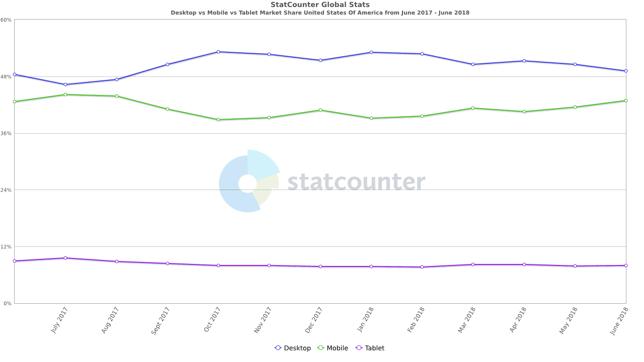
According to StatCounter, searches from desktop computers and mobile devices in the US are virtually neck and neck with a small edge for mobile.
Device Atlas suggests that there are over 2.6 billion smartphone users worldwide
The most important stat to consider when making the decision about a mobile version of your website is shared by Greg Sterling (love the last name), contributing Editor at Search Engine Land. According to Mr. Sterling, about 56% of traffic to top US sites is coming from mobile devices. That’s right. More than half of all website searches are performed using mobile devices. If this information alone isn’t enough to change your mind, please go back into your cave.
People expect a great website experience when using large desktop computers, laptops, tablets and smartphones. They’re looking for something that’s properly formatted no matter the device they happen to be using.
There are many ways to build what’s been coined a “mobile friendly” website. The technical details can be daunting, so we will share visual representations. You’ll get the gist.
The five most common problems we see with mobile versions of websites

1. Tiny On A Smartphone
This is the biggie: websites meant only for full size computer screens. They appear tiny on smartphones. These websites require that you zoom in and out by pinching or stretching two fingers simultaneously. It means no effort was ever put toward making the website mobile friendly.

2. Huge On A Smartphone
Some websites are too big on a smartphone and you have to swipe all around the screen to move the website into a position that will somehow work. The page typically cannot be sized by pinching or stretching with your fingers. It’s massive and unwieldy. Again, the developer never tried to offer a better mobile experience.
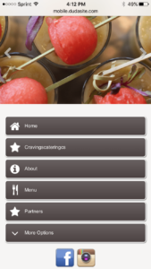
3. Just Buttons That Are Ugly
Many mobile versions of websites are literally just buttons. Nothing branded, no images, nothing even slightly interesting. Essentially, the company has two different websites; one for larger screens and the mobile version for all other screen sizes.
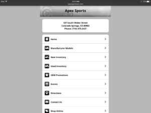
4. Giant Buttons On Tablet:
Having a mobile version of a website that’s all about buttons poses yet another problem. When using a tablet, all you see is a bunch of giant buttons formatted for phones. Sometimes they’re designed to span the entire width of the page. It’s really ugly and obviously not well thought out.
5. A Site That’s Separate On Mobile:
Many mobile websites use a second domain that’s separate from their full size counterparts (e.g.: www.abccompany.com vs. m.abccompany.com). Instead of driving all traffic to a single website, all work is doubled to maintain two completely different versions of a website.
Responsive Design Is Best For All Devices
Responsive design ensures your website- and only one version of it– will automatically change and adapt to all devices. During the development process, certain elements can be configured to collapse, hide, be turned off or react differently based on the screen size of the device accessing the site.
In the examples below, you’ll notice that we’ve tweaked some things based on what type of device people are searching from. Why? Because mobile networks tend to be slower and using them means it takes longer to load things like videos and animations.
One cool thing to note is the parallax effect. When moving the cursor on a full size screen, the coffee background image shifts side-to-side. This translates well to mobile devices because the same gyroscope or accelerometer (think about those games where you navigate a BB through a maze) that determines screen orientation also moves the image side-to-side on a tablet or smartphone.
When accessing our website from a full size laptop screen, the site includes:
- Several animations where elements of the page move or fade in from the sides or the bottom as you scroll
- Hovering animations that react to a hovering cursor
6. Transition to a Modern Look and Feel
We evaluate thousands of websites every year, and from a style perspective, there’s a list of things we suggest changing. A list of things we constantly see:
- A static site with nothing that moves, shifts or does anything remotely interesting visually
- A boxed design where all content is stuck between the borders of a narrow column on each page
- A template where all pages look and feel almost exactly the same with little to no difference between them
Basically, the majority of older websites are boring. They’re dull. They struggle to keep visitors clicking through.
So, what’s in store for those looking to take the leap to something new?
Animations
Animations are a great way to keep visitors intrigued and wanting to click through to the next page. Whether page elements slide in from the side, fade in from the bottom or flip around when you hover, animations can change the entire look and feel of a website. Something that’s static and stale can quickly become fun, slick or elegant with a little movement.
As you consider whether or not to include movement throughout your site, it’s important to understand your audience. You might personally love how things shift around, but some users (especially the older generation) find it nauseating. Case in point is a client of ours, Darlene Avery with All Life Long Counseling and Consulting, that helps people with end of life care. Many of her clients suffer from debilitating disorders that are easily exacerbated by too much visual stimulation. Her site includes very little movement whatsoever.
It’s also important to understand how animations effect load times. If it takes too long for a page element to animate, visitors may find the site archaic and prefer to move on. Striking a balance of animation delay is important.
Parallax
Like animations, parallax is a bit of a love/hate effect. Parallax makes background images scroll at a rate different than the rest of the page. It’s difficult to describe, so check out the parallax on Chief Petroleum’s website https://www.chiefpetroleum.com/
You very quickly either loved or hated what you just saw. Take it or leave it, parallax has become very popular and it’s here to stay.
One drawback to parallax is that some browser/hardware combinations don’t handle it well. Instead of a smooth scrolling effect, you get something choppy and strange. Keep this in mind as you make your final decision about a design.
Video
Video is dominating the way people consume content. If you’re doing nothing with video, you need to start somewhere and your website is a great place to do it. These stats from Insivia’s January 2017 article are mind blowing:
- By 2017, online video will account for 74% of all online traffic (KPCB).
- 55% of people watch videos online every day (MWP).
- Including video in a landing page can increase conversion by 80% (EyeView).
- Online shoppers who view demo videos are 1.81x more likely to purchase than non-viewers (DMB Adobe).
- Nearly two-thirds of consumers prefer video under 60 seconds (Animoto).
- People spend on average 2.6x more time on pages with video than without (Wistia).
***There are 21 more stats from this article that are well worth checking out***
People tend to get caught up in the production details of a solid video. It’s true that a high-end, polished video can be an amazing asset, but it’s not required. If you have a decent smartphone and no budget, just create something. Purchase a tripod for your phone, record something interesting, use some free video editing software to trim things up and upload the video to a YouTube account. From YouTube, your video can be shared all over the internet, including embedding it in your website.
Some pointers:
- Make sure whatever you’re filming is well lit
- Eliminate background noise
- Check to make sure it’s loud enough (If it’s not, you can sometimes fix the loudness in your video editing software)
- The most intuitive and free editing software on PC is Windows Movie Maker. iMovie is the best free option for Mac.
Not sure how to get started editing? YouTube is a fantastic resource with hours and hours of tutorials.
Music
If you’ve ever visited a website that scares you with blaring sound, you’ll understand why we choose to keep our own silent. Music and other sounds can be fun, but human behavior is to immediately mute something we aren’t expecting.
If you’d like to include sound somewhere in your site, make the audible experience optional. If someone wants to listen, offer options to play, pause and stop the sound at will. It’s important to include these options for videos as well.
Different Shapes
Have you ever considered, in its simplest form, the design of a website? What shape is repeated over and over again? What shape is the device you’re reading this blog post from?
Rectangles everywhere!
As someone who’s only a little creative, this can get frustrating. Rectangles on rectangles on rectangles are lame. Use other shapes throughout your site to break up the monotony. Circles, ovals, and diamonds are the most common alternative shapes to use.
There’s also science behind the idea of rounded corners. The human brain takes extra time to decipher the points of shapes with sharp corners. When sharp corners are replaced with a rounded look, the mind doesn’t require as much computing power to process the overall shape.
Different Layouts
For a long time, websites were very predictable. Most maintained the same boring layout. They were boxed so they didn’t span the entire page and left large gaps to the left and right of content on each page. They all had rectangular buttons for menus across the top. Most pages looked exactly the same no matter the subject matter.
If you’re looking for something radical and new, the CSS Winner website is a great place to start. CSS Winner evaluates and awards designs for being the best of the best. Be aware that many of these sites are resource intensive. If your internet speeds or computer do not meet the minimum specifications for displaying things properly, you will have a frustrating experience.
The Price Of Something Too Complex
Many of our clients do not understand the true cost of more advanced features. Not just complex coding, but filming, editing, graphic design, etc. Most of these sites are built by college students honing their skills and using ultra powerful tools to develop animated environments.
The cost for these types of features adds up very quickly. Many of which could rack up a $20,000 charge or more. How many small business owners do you know who possess a $20,000 website?
The opportunity cost of an intense website is also something important to consider. If you visited some of the more complicated CSS Winner sites at the link above, you found they were pushing your computer to its limit. Your computer got hot and your fan shifted into high gear. This could be a real problem if the potential buyers visiting your website aren’t using the right hardware or their internet connection is slow. Page elements take too long to load and certain functions just aren’t performed properly. Users will leave your site as soon as things don’t function as expected. What’s it worth to lose potential customers visiting a website that’s too complex?
There is a happy middle ground. You can have a great looking website with tons of bells and whistles… without the high price tag. Animations are a great way to keep visitors intrigued and wanting to click through to the next page. Whether page elements slide in from the side, fade in from the bottom or flip around when you hover, animations can change the entire look and feel of a website. Something that’s static and stale can quickly become fun, slick or elegant with a little movement.
As you consider whether or not to include movement throughout your site, it’s important to understand your audience. You might personally love how things shift around, but some users (especially the older generation) find it nauseating. Case in point is a client of ours, Darlene Avery with All Life Long Counseling and Consulting, that helps people with end of life care. Many of her clients suffer from debilitating disorders that are easily exacerbated by too much visual stimulation. Her site includes very little movement whatsoever.
It’s also important to understand how animations effect load times. If it takes too long for a page element to animate, visitors may find the site archaic and prefer to move on. Striking a balance of animation delay is importan