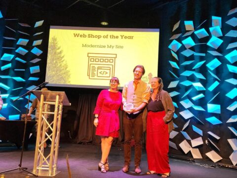

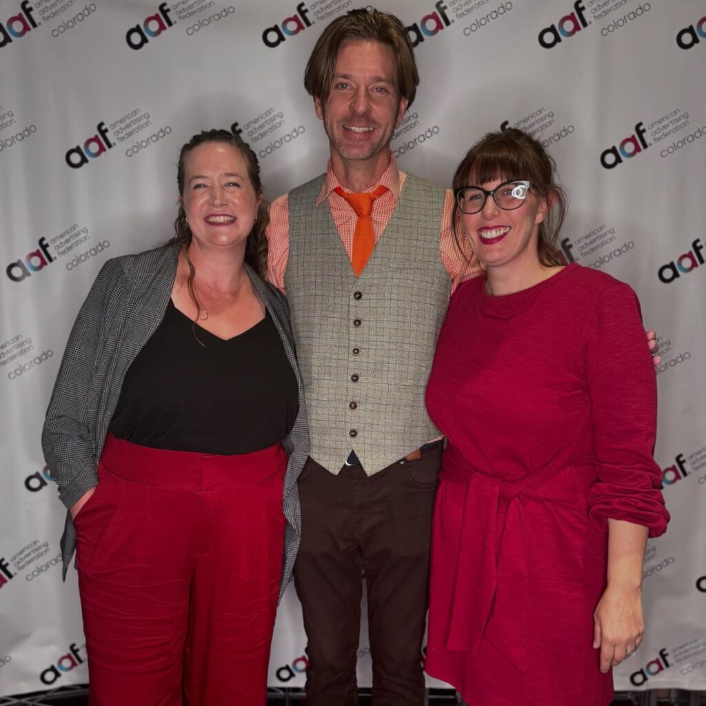
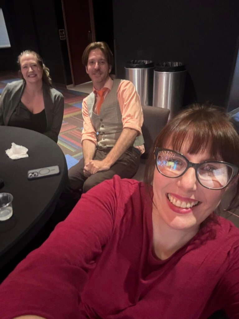
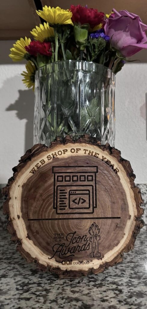
Award-Winning Web Design: Modernize My Site Clinches 'Best Web Shop 2024' Icon Award
Modernize My Site has been crowned the “Best Web Shop 2024” at the prestigious AAF Colorado Icon Awards. This accolade isn’t just another trophy – it’s a testament to our commitment to crafting exceptional, user-centric WordPress websites that drive results for businesses of all sizes.🎉🏆
The Icon Award: More Than Just a Shiny Paperweight
The American Advertising Federation of Colorado, the oldest and largest advertising trade association globally, doesn’t hand out awards like candy at Halloween. The Icon Award represents the pinnacle of web design excellence, recognizing agencies that push the boundaries of creativity and functionality in building websites that make a huge difference for local businesses and ecommerce ventures alike.
What This Award Means for You:
Validation: Your WordPress site is in the hands of recognized industry leaders.
Innovation: We’re at the forefront of web design trends and best practices for WordPress themes and plugins.
Results: Our award-winning approach translates to better ROI for your business website.
Building Snazzy WordPress Websites
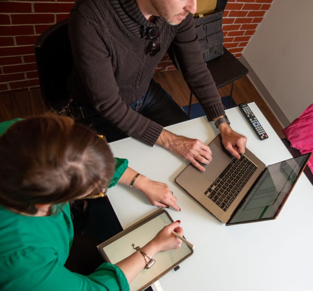
In the age of template-driven design and AI website builders, Modernize My Site stands out by creating bespoke WordPress websites that don’t just look good—they perform exceptionally well for your target audience.
Why Choose Us? Because We're People, Not Chatbots
Custom WordPress development tailored for any business including ecommerce businesses
Responsive design optimization for a user-friendly interface across all devices
SEO-driven information architecture to help you reach more customers
FAST Builds with our new One Week Website process that does not sacrifice quality for speed.
Innovating New Processes to compete with AI
Spoiler: We’re Winning (Sorry robots.)
While AI tools might be the buzzword du jour, at Modernize My Site, we believe in the power of human creativity augmented by cutting-edge technology to create versatile tools for your business success.
Our Secret Weapon: The Human Touch (and Coffee, Lots of Coffee)
We bring a human touch to this digital world, understanding your business needs beyond what a drag and drop editor can offer.
We listen to your needs to build the WordPress site of your dreams, complete with premium themes and plugins.
We translate your ideas into digital reality with brand integration, a user-friendly UX design, and features like abandoned cart recovery for ecommerce businesses.
We launch your perfect website, optimized for performance and SEO-driven to snatch the attention of your target audience. Your website will be more than just a home page—it’ll be a versatile tool that can make a huge difference in helping you sell products online.
Professional Designer Vs Ai Website Builder
Sure, an AI website builder can generate a website faster than you can say “algorithm,” but can it understand the nuances of your brand identity or create an emotional connection with your audience? We think not. AI has its place as an excellent tool to help growing businesses, but it’s not a replacement for professional web designers who can craft landing pages that convert.
Why We're Better Than Robots:
We have emotions (mostly positive ones, we promise)
We understand sarcasm, in fact we are fluent in it! (unlike some virtual assistants we know)
We won’t try to take over the world (probably…at least not today, we’re busy building websites today.)
The Modernize My Site Advantage:
Tailored Solutions: We don’t do one-size-fits-all.
Strategic Thinking: Every design decision is backed by data and experience to make WordPress sites that stand out.
Ongoing Support: With our hosting packages and ongoing care, we’re in it for the long haul, not just until launch day.
Why Choose an Award-Winning Agency for Your Web Design Needs?
Selecting Modernize My Site means partnering with a team that’s been recognized for excellence in web design and development. Our Icon Award is proof that we don’t just talk the talk—we walk the walk, in some pretty stylish shoes, if we do say so ourselves.
Your website could be our next winning Website design!
Get started with Modernize My Site on a snazzy website that utilizes:
Cutting-edge design trends for eye-catching WordPress themes
Advanced SEO strategies to boost your site’s visibility
E-commerce optimization to help you sell products online without hefty transaction fees
Mobile-first development for a seamless user experience across all devices
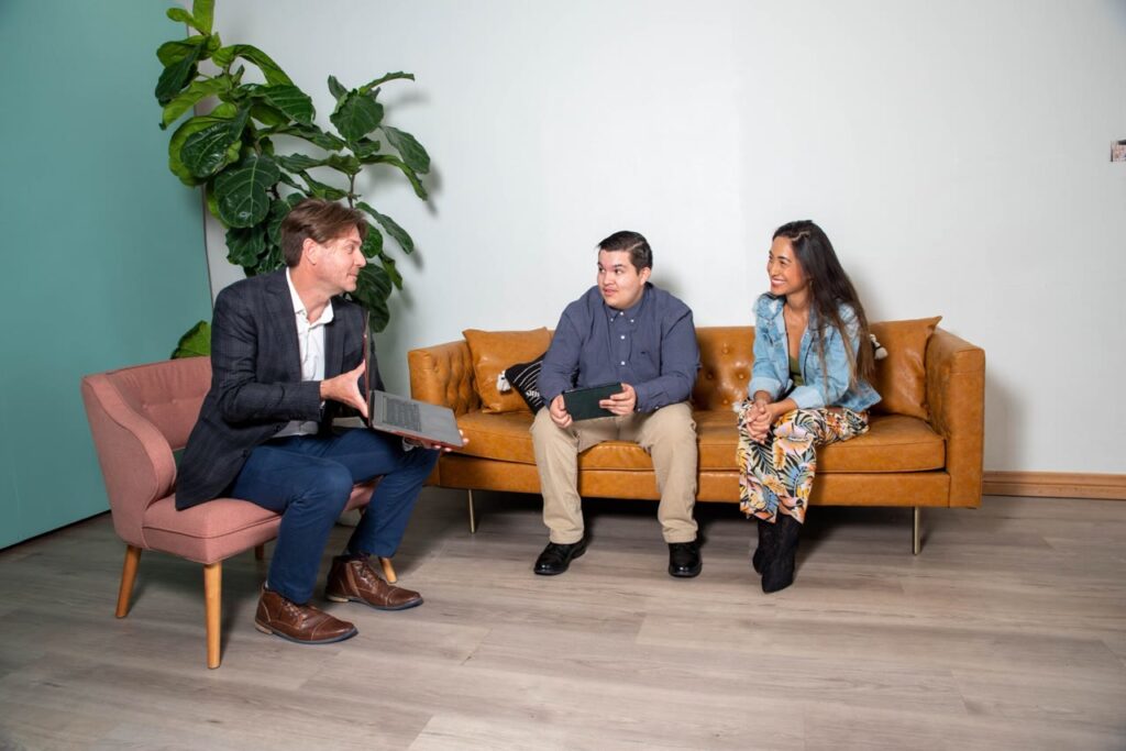
The Modernize My Site Difference: We're People, Not Pixels
At Modernize My Site, we believe that great websites are born from great relationships. We’re not just another faceless digital agency—we’re your partners in online success.
Our Approach:
Face-to-Face Consultations: We prefer coffee shops or Zoom meetings to chatbots when discussing your business website needs.
Transparent Communication: No tech jargon or hidden agendas here, just clear talk about WordPress websites that help build your brand and your business.
Collaborative Design Process: Your input on your own content and design is invaluable, not an inconvenience.
Our Love Language: Building Kickass Websites
At Modernize My Site, we’re all about spreading the love. And by love, we mean creating websites that make your competitors weep with jealousy. From small businesses to massive corporations, new business owners to seasoned veterans of their craft, we treat every client with the same care and attention. Your time is valuable, that’s why every project is the VIP on your build week. Find out more about our process.
Ready to Elevate Your Online Presence?
If you’re tired of cookie-cutter websites that blend into the digital landscape, it’s time to experience the award-winning difference of Modernize My Site. Let’s create a web presence that not only looks stunning but also drives real business results.
Ready to Join the Modernize My Site Family?
Take the Next Step:
Schedule a Consultation to discuss your WordPress website needs
Request a Custom Quote for your business website project
Explore Our Portfolio of Award-Winning WordPress Designs
Don’t settle for mediocrity in your web presence. Choose Modernize My Site—where award-winning design meets unparalleled functionality. Because in the world of web design, being “good enough” is simply not good enough for your growing business.
Contact us today and let’s start building your digital masterpiece. After all, shouldn’t your website be as impressive as your business?